
It is the Karma photo hunt challenge – the first photo hunt we’ve had from Karma in awhile. Karma has challenged us to “Choose a color that you are drawn to. Tell me what it is that draws you to this color. If you’d like, take it a step further and do a little research like Joanne did and find out some of the psychology of your chosen color.” Of course, we are also to post at least 3 photos of the colors we’re drawn to.
I have chosen to stay inside for this challenge. We’ll start with my closet:
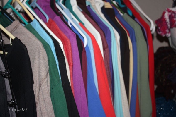
In apparel, I am drawn to many colors – reds in various shades, blues in various shades, greens isn various shades, browns here and there, a little black. No gray. Nope. Nada! Reading about the psychology of colors, I would say perhaps my personality is just a bit mixed up. A little of this, a little of that.
We’ll move on to what I use in decorating, because I think my closet has had enough attention. My house is mostly in neutrals, tans by and large, with touches of color here and there. We do have a couple of walls painted in a burgundy/cranberry color – just because. I didn’t take pictures of those, however.
Online, at one of the websites I viewed (sorry I failed to pay attention to the URL), it said this about burgundy reds: “Burgundy: a dark purplish red, it is more sophisticated and serious and less energetic than true red. It indicates controlled power, determined ambition and dignified action and is often favored by the wealthy.” I confess to liking to have control. I confess to being determined when I decide I want something a certain way. Husband would say stubborn. I prefer determined. He is the one who is stubborn. I think I am, by and large, dignified. Most of the time. Not always.
 Embarrassing – I only realized that half of these old encyclopedias are upside down when I was editing the photo.


The figurine of the Mandarin man and the vase came back home with me from Beijing. Mixed in with the winey red is a bit of celadon green, which is a color I find myself more and more drawn to.
 Candles, with a bit more of a rusty red in them.
 In the bathroom, a touch of orange – the only place in the house that has orange. I think I was drawn as much to the rooster and the green in the pitcher and the green in the curtain.
 The centerpiece on the dining room table – decorative balls in neutrals, with one in red and one in green. I really must think to remove papers and such that are in the camera range when I’m taking pictures.
As I alluded to, I am finding myself drawn more and more to green lately. I am considering repainting those cranberry walls to a celadon – but husband is anti-green. Online, it is reported that green: “The color green is the color of balance and harmony. From a color psychology perspective, it is the great balancer of the heart and the emotions, creating equilibrium between the head and the heart.
From a meaning of colors perspective, green is also the color of growth, the color of spring, of renewal and rebirth. It renews and restores depleted energy. It is the sanctuary away from the stresses of modern living, restoring us back to a sense of well being. This is why there is so much of this relaxing color on the earth, and why we need to keep it that way.
Green is an emotionally positive color, giving us the ability to love and nurture ourselves and others unconditionally. A natural peacemaker, it must avoid the tendency to become a martyr.”


A couple of bits of green in my home – the green glass goblets I found at a garage sale many years ago, that now hold tealight candles. I love the way the flames glimmer through the green glass. And a wall-hanging my daughter had the grandkids do when they were but wee folk. A treasure that will always be with me.
In reading the psychology of the color green, I can understand completely why it is a color I find myself more and more drawn to. It fills a need I have in this life at this time.
Years ago, my color was blue, primarily cobalt blue. I still am drawn to blues in my apparel, just not so much in my home. To see more about the psychology of blue: Empower Yourself with Color.
Thank you, Karma, for this photo hunt! I have missed these.


Have been painting inside walls and I also prefer neutral colors. Very much like you have.
But I have a lot of black in my wardrobe and black is not a colour
🙂
LikeLike
Ahhh, but black is all colors put together. I think black is elegant – that “little black dress” thing, and I think I would be smarter to stick to neutrals with color in the accessories. Maybe someday.
Sent from my iPad
LikeLike
Carol – I love the photographs and the colors you’ve shared. As a holistic health practitioner, one of the many energy-based modalities I use is Color Therapy. With that in mind, here’s a link to the page on my website where you can find out what a person’s attraction/repulsion means — body, mind, and spirit: http://www.holessence.com/m%C3%A9lange/thecolorofwellness.html
LikeLike
Thank you! Interesting because when I surrounded myself with blues, I was also heavily into creative activities. Now, responsibilities dominate and there is less creative time.
Sent from my iPad
LikeLike
Carol – Most interesting, indeed 🙂
LikeLike
Dear Carol,
This is a fascinating post! I loved hearing all about the colors, their effects, and how you have incorporated them into your home. I have always been drawn to purple–and for a lifetime, that has been my color. A few years ago, I painted our bedroom a soft sage green, that looks so good against white woodwork. I added sage blinds, and it looks lovely with a purple and green quilt, and a lamp I painted to match. I must have been looking for more calm in my life! I also painted living room walls sienna, the kitchen two shades of yellow and cornflower blue, the guest bathroom magenta, aqua, and deep purple, Eli’s room (by his choice), orange-red and goldenrod, and Bea chose walls of tangerine, lime green, lemon yellow, and teal. It really pops! I don’t know what came over us, but we love it!
LikeLike
It sounds fun. You are such an artistic family, I am not surprised.
Sent from my iPad
LikeLike
LOVE the painting from your grandkids. I just wrote my daughter-in-law and told her I knew what I wanted for Christmas!!!! Hope you don’t mind.
LikeLike
Don’t mind at all. It’s a wonderful family heirloom, don’cha think?
Sent from my iPad
LikeLike
Very fascinating, Carol. Love what you did with Karma’s photo hunt! My mouth did drop open when looking at your closet shot, though. Had been lying in bed earlier this week, looking at the multi-colored hangars (more than the clothes) and lazily pondered taking a photo of the closet. Looks like the Universe decided it wanted a picture of your closet instead!
LikeLike
A closet which now needs to have the warmer winter clothes pulled out and summer things put in. Any minute now. The colors are much the same though.
Sent from my iPad
LikeLike
Yep, I need to do the winter-summer switch, too, one of these days…
LikeLike
Love your sophisticated red…and agree that green is intriguing.
LikeLike
Have you noticed that green is a colour that people either love a lot, or dislike a lot, Carol? I had my family room walls painted in a lovely gentle shade of green once, with greens and pinks in the curtains and I really loved the whole feel of the room, yet some people would say, “oh, this room is so GREEN!” I decided it was my house and I liked it, so that was that, until I tired of the green and changed the walls to a more neutral colour (where my bugundy lounges would match better!) 🙂
LikeLike
Yes, Joanne, I have noticed that. I wonder what that’s all about. There are some shades of green for which I have no tolerance – that horrid shade they used to use in government buildings when I was a civil servant many years ago.
Sent from my iPad
LikeLike
What a conglomeration of color, Carol! I think I’m still not sure which color you chose for this photo hunt, lol! That’s okay – I thoroughly enjoyed this peek into your world and your colors!
LikeLike
You probably can’t know what color I chose, Karma, because I couldn’t decide which one to choose.
Sent from my iPad
LikeLike
Looks like a lovely cornucopia of color 🙂
I couldn’t possibly pick one favorite color either. I think I’m going to steal your goblet/candle idea!
LikeLike
Please do, Heather.
Sent from my iPad
LikeLike
It’s all very interesting … I’ve always loved purple, even when it was waaaaaay out of fashion and you couldn’t buy purple clothes for love nor money. Blue and orange (opposites on the colour wheel) have never been favourites, though for me orange is positively unpleasant, whereas I do like some blues. Greens are always good, but only in muted or deep shades. Blues and yellows are refreshing and I love to mix them with certain greens. I don’t like browns.
It’s only lately I’ve discovered how to mix purples, dark reds, dark blues (berry shades), with greens and maybe a little grey, certain shades of turquoise, or pink for piquancy. I LOVE this colour palette and I’m so glad that at the moment, I can buy clothes in all these colours … though summer wardrobes are always lighter, of course. I don’t know what all that says about me.
Heading over to Laurie’s site to find out!
LikeLike
I would say perhaps my personality is just a bit mixed up. Nawwww, you’re just a 96 Crayon box kind of gal, like me!! I keep thinking I’ll get outside to take a few photos, but then it begins raining….again. Loved the interior tour. Hope you have a great week. xoxo
LikeLike
Pingback: Wrapping Up Color | Karma's When I Feel Like It Blog